CSS Positioning
Dr. Greg Bernstein
Updated September 12th, 2021
CSS Positioning
Learning Objectives
- Understand normal flow layout of HTML pages
- Understand and use the CSS positioning types to alter the normal flow for certain elements.
- Understand and use: static, relative, absolute, and fixed positioning
- Understand and be able to use positioning to create various GUIs
Readings
Reference/Further Information
- Invisible CSS. Good review and in depth look at important CSS concepts.
Positioning Overview
From MDN:
Positioning allows you to take elements out of the normal document layout flow, and make them behave differently, for example sitting on top of one another, or always remaining in the same place inside the browser viewport.
Document Flow
- Individual element boxes are laid out by taking the elements’ content, then adding any padding, border and margin around them (box model)
- By default, a block level element’s content is 100% of the width of its parent element, and as tall as its content.
Document Flow 2
- Inline elements are all tall as their content, and as wide as their content.
- You can’t set width or height on inline elements
- If you want to control the size of an inline element, you need to set it’s CSS display property to block or inline-block.
Normal Flow
…is the system by which elements are placed inside the browser’s viewport.
Block level elements are laid out vertically in the viewport
Inline elements sit on the same line as one another as long as there is space for them to do so inside the width of the parent block level element.
If there isn’t space, then the overflowing text or elements wil move down to a new line.
Margin Collapse
If two adjacent elements both have margin set on them and the two margins touch, the larger of the two remains, and the smaller one disappears.
Positioning Types
- static — The same as normal flow
- relative — Relative to where it would have been in the normal flow.
- absolute — Location in its container’s coordinate
- fixed — Location in the window’s coordinates
Relative Positioning
- The block that is relatively positioned is treated like it is still in the flow for the purpose of placing other elements.
- You use the top, bottom, left, or right CSS properties to adjust the blocks position.
Base Example
HTML & CSS
<style>.posEx {width:20%; background-color:aliceblue;
border: solid 1px;}
 .posEx.reg {background-color: yellow; }
</style>
<p class="posEx">Para 1</p>
<p class="posEx reg">Para 2</p>
<p class="posEx">Para 3</p>
<p class="posEx">Para 4</p>
Base Example Rendered
Para 1
Para 2
Para 3
Para 4
Relative Example
<style>.posEx {width:20%; background-color:aliceblue; border: solid 1px;}
 .posEx.rel2 {background-color: yellow; position: relative; top: -20px; left:20px;}
</style>
<p class="posEx">Para 1</p>
<p class="posEx rel2">Para 2</p>
<p class="posEx">Para 3</p>
<p class="posEx">Para 4</p>
Example
Para 1
Para 2
Para 3
Para 4
Why Relative Positioning?
- Good for “small” tweaks such as adjusting small graphics to line up better.
- Other uses…
- Note that values can be positive or negative.
- Note that space is kept for where the element would have been.
Absolute Positioning Example 1
<div style="position: relative">
<style>.posEx {width:20%; background-color:aliceblue; border: solid 1px;}
 .posEx.abs2 {background-color: yellow; position: absolute; top: 20px; left:20%;}
</style>
<p class="posEx">Para 1</p>
<p class="posEx abs2">Para 2</p>
<p class="posEx">Para 3</p>
<p class="posEx">Para 4</p>
</div>
Absolute Positioning Example 2
Para 1
Para 2
Para 3
Para 4
Absolute Positioning
- Takes the positioned block out of the flow completely, i.e., no space is left.
- top, bottom, left, right are in the “positioning context” coordinates
Positioning Contexts
- By default the
<html>element is the positioning context for an absolutely positioned element. - We can change this to another ancestor of the absolutely positioned element by adding the style
position: relativeto the container element. - I did this with the containing
<div>in the previous example. This is easy to forget and can cause a lot of debugging time!!!
z-index
From MDN z-index
The z-index property specifies the z-order of a positioned element and its descendants. When elements overlap, z-order determines which one covers the other. An element with a larger z-index generally covers an element with a lower one.
z-index Example 1
<div style="position: relative">
<style>p.zEx {width:20%; background-color:aliceblue; border: solid 4px; height: 30vh;}
p.off1 {background-color: yellow; position: absolute; top: 20vh; left:20%;}
p.off2 {background-color: #4ddddf; position: absolute; top: 25vh; left:24%;}
p.off3 {background-color: #e0aefd; position: absolute; top: 30vh; left:28%;}
p.off4 {background-color: #fc8bb1; position: absolute; top: 35vh; left:32%;}
</style>
<p class="zEx off1">Para 1</p>
<p class="zEx off2">Para 2</p>
<p class="zEx off3">Para 3</p>
<p class="zEx off4">Para 4</p>
</div>
z-index Example 2
All are positioned so overlap is in document order:Para 1
Para 2
Para 3
Para 4
z-index Example 3
Set z-index higher on third paragraph.
<div style="position: relative">
<style>
p.raiseZ {z-index: 5}
</style>
<p class="zEx off1">Para 1</p>
<p class="zEx off2">Para 2</p>
<p class="zEx off3 raiseZ">Para 3</p>
<p class="zEx off4">Para 4</p>
</div>
z-index Example 4
Set z-index higher on third paragraph.Para 1
Para 2
Para 3
Para 4
z-index Example 5
Set z-index higher on 2nd paragraph.
<div style="position: relative">
<style>
p.raiseZ {z-index: 5}
</style>
<p class="zEx off1">Para 1</p>
<p class="zEx off2 raiseZ">Para 2</p>
<p class="zEx off3">Para 3</p>
<p class="zEx off4">Para 4</p>
</div>
z-index Example 6
Set z-index higher on 2nd paragraph.Para 1
Para 2
Para 3
Para 4
Why Abs Pos/z-index?
- Great for all sorts of effects with layered content
- Tabbed panes, etc.
- Good for stuff relative to a container.
Caution z-index
- When things that you are stacking are in different containers things can get tricky.
- There are rules for this situation: See the Understanding z-index
Fixed Positioning
From MDN:
…fixed positioning fixes an element in place relative to the browser viewport itself. This means that you can create useful UI items that are fixed in place, like persisting navigation menus.
Fixed Positioning Notes
- Can’t demonstrate it in slides so we’ll need a separate file
- Don’t need fixed positioning if your page doesn’t scroll!
- Hence for example we’ll need a page with enough content to need scrolling.
- See my fixedPositioning.html for example of selectable fixed or static layout on a
<header>element.
Fixed Positioning Gotchas
- You need to set the top, left or bottom, right position coordinates.
- You may need to use margin-top on the following element to move it out from under the fixed element depending on your application.
Fixed Example HTML
<!DOCTYPE html>
<html lang="en">
<head>
    <title>Fixed Positioning Example</title>
</head>
<body>
    <header>
        <p>Our Heading/Branding Area!</p>
        <div class="controls">
            <input id="Static" type="radio" name="PosIt" checked value="Static">
            <label for="Static">static</label>
            <input id="Fixed" type="radio" name="PosIt" value="Fixed">
            <label for="Fixed">fixed</label>
        </div>
    </header>
    <section class="Blabber">
        <p> Leverage agile frameworks to ...</p>
        <p> Bring to the table win-win survival...</p>
        <p> Capitalize on low hanging fruit... </p>
        <p>Podcasting operational change ...</p>
        <p>Collaboratively administrate ...</p>
    </section>
</body>
</html>
Fixed Example JS
var header;
var blabber;
function radioHandler(event) {
  // Toggling two classes on/off at the same time!
  header.classList.toggle("FixedHead");
  blabber.classList.toggle("AdjustBlabber");
}
window.onload = function() {
  header = document.querySelector("header");
  blabber = document.querySelector(".Blabber");
  let radios = document.querySelectorAll("[type='radio']");
  for (let radio of radios) { // Is there a better way?
      radio.addEventListener('change', radioHandler);
  }
}
Fixed Example CSS
.FixedHead {
    position: fixed;
    top: 0px;
    left: 0px;
}

.AdjustBlabber { /* Fixed doesn't reserve space! */
    margin-top: 98px;
}

body {margin: 0;}
header {
    background-color: cadetblue;
    color: white;
    width: 100%;
}

header p,
header>div {
    display: inline-block;
    font-family: sans-serif;
    padding: 1em;
}

header p {
    border-right: 2px solid;
}

section.Blabber {
    width: 200px;
    margin-left: auto;
    margin-right: auto;
}
CSS Drop Downs
CSS Only Drop Downs
- Use of
displayproperty (none, block) - Use of
relativeposition to establish context - Use of
absoluteposition for “drop down” (or “pop up”)
Example Drop Down
Hello World!
Hello Web Dev!
HTML for Drop Down
<div id="DropEx">
  <div class="dropdown">
    <span>Mouse over me</span>
    <div class="dropdown-content">
      <p>Hello World!</p>
    </div>
  </div>

  <div class="dropdown">
    <span>Another</span>
    <div class="dropdown-content">
      <p>Hello Web Dev!</p>
    </div>
  </div>
</div>
HTML Organization & Functionality
- Outer
<div id="DropEx">: Used to isolate the styling of this example from the slide styling. <div class="dropdown">: Used for setting up individual drop downs and as a hover target.<div class="dropdown-content">: Used to hold the content of the “drop down” (or “pop up”)
CSS for Dropdown 1
Why do we need relative? Why do we need inline-block?
#DropEx .dropdown {
  position: relative;
  display: inline-block;
}

#DropEx span {
  display: inline-block;
  background-color:beige;
  width: 10em;
}
CSS for Dropdown 2
Use of absolute positioning. Use of display property.
#DropEx .dropdown-content {
  display: none;
  position: absolute;
  left: 10px; /* sets from container left */
  top: 30px; /* sets from container top */
  background-color: aliceblue;
  padding: 0.5em;
  border: solid blue 10px;
  min-width: 10em;
  z-index: 1;
}

#DropEx .dropdown:hover .dropdown-content {
  display: block;
}
Practical Positioning Example
Tabbed Panes
- MDN Practical positioning examples
- We’ll give a highlevel approach similar to both MDN and BootStrap.
- Example Tab Implementation
Rough Product example
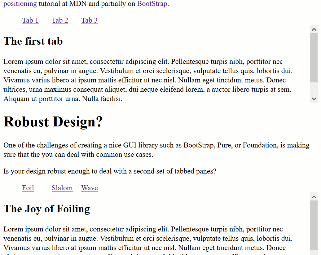
Design
- Need clickable items to initiate showing of information in each of the tabbed panes, i.e., the tabs.
- Will have the panes all occupy the same absolute location within a container then change the z-index in response to clicks.
Tabbed HTML Structure
A hybrid approach between MDN and BootStrap
<section class="tabbed-panes">
    <ul class="tabbed-controls">
        <li><a href="#Foil" class="active">Foil</a></li>
        <li><a href="#Slalom">Slalom</a></li>
        <li><a href="#Wave">Wave</a></li>
    </ul>
    <div class="panes">
        <article id="Foil" class="active-pane">
            <h2>The Joy of Foiling</h2>
            <p>Blah...e</p>
        </article>
        <article id="Slalom">
            <h2>The Speed of Slalom</h2>
            <p>Stuff...</p>
        </article>
        <article id="Wave">
            <h2>The Challenge of Waves</h2>
            <p>More stuff...</p>
        </article>
    </div>
</section>
Design of HTML
- Overall container for the entire widget
section.tabbed-panes - Controls for the widget
ul.tabbed-controls - Content container (positioning context):
div.panes - Absolutely positioned contents:
.panes article
Rough CSS
.active-pane { /* brings to front */
  z-index: 1;
}

* {
  box-sizing: border-box;
}

section.tabbed-panes {
  height: 12em; /* Overall widget height */
  border: dashed red 2px;
}

div.panes {
  position: relative;   /* Establish context! */
}

div.panes>article {
  height: 8em; /* Fit inside containers space */
  overflow: auto;
  position: absolute;
  background-color: white; /* Opaque, stuff underneath doesn't show */
  border: lightgray solid 2px;
  padding-left: 0.3em;
  width: 100%; /* take full width even if shorter */
  top: 0;
  left: 0;
}

.tabbed-controls li {
  width: 10%;
  display: inline-block;
  list-style: none;
}
JavaScript Concepts
- Respond to click events on
<a>in the.tabbed-controls- Do you need to stop the default behavior?
- Add or remove
active-paneclass to appropriate<article>s to adjust z-index - Make sure code can deal with more than one
tabbed-panessection in the document. (BootStrap can, MDN cannot)
Example JavaScript
function tabClick(event) {
  event.preventDefault();
  let target = event.target;
  let href = target.getAttribute("href");
  console.log("Tabbed clicked: " + target);
  console.log("Href: " + href);
  let tabSection = target.parentElement.parentElement.parentElement;
  console.log(tabSection);

  // Remove the active-pane class from all panes within
  // this tabSection
  let panes = tabSection.querySelectorAll('.panes article');
  panes.forEach(function(p) {
    p.classList.remove("active-pane");
  });
  let activePane = tabSection.querySelector(href);
  activePane.classList.add("active-pane");
}

window.onload = function() {
  let tabControls = document.querySelectorAll(".tabbed-controls>li");
  tabControls.forEach(function(tc){
    tc.addEventListener("click", tabClick);
  });
}