CSS Flexbox
Dr. Greg Bernstein
Updated September 14th, 2021
CSS Layout Flexbox
Learning Objectives
- Understand flexbox as a layout technique based around a primary (single) axis
- Understand properties that apply to the flex container versus the flex items
- Understand that you have control over main axis, cross axis properties, and wrapping related properties
Readings and More
Flexbox Froggy “a game where you help Froggy and friends by writing CSS code!”
Live Practice Files
Experiment with these are you read these notes:
From MDN flexbox0.html, container is the
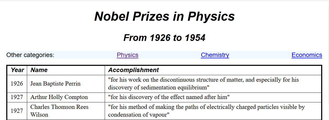
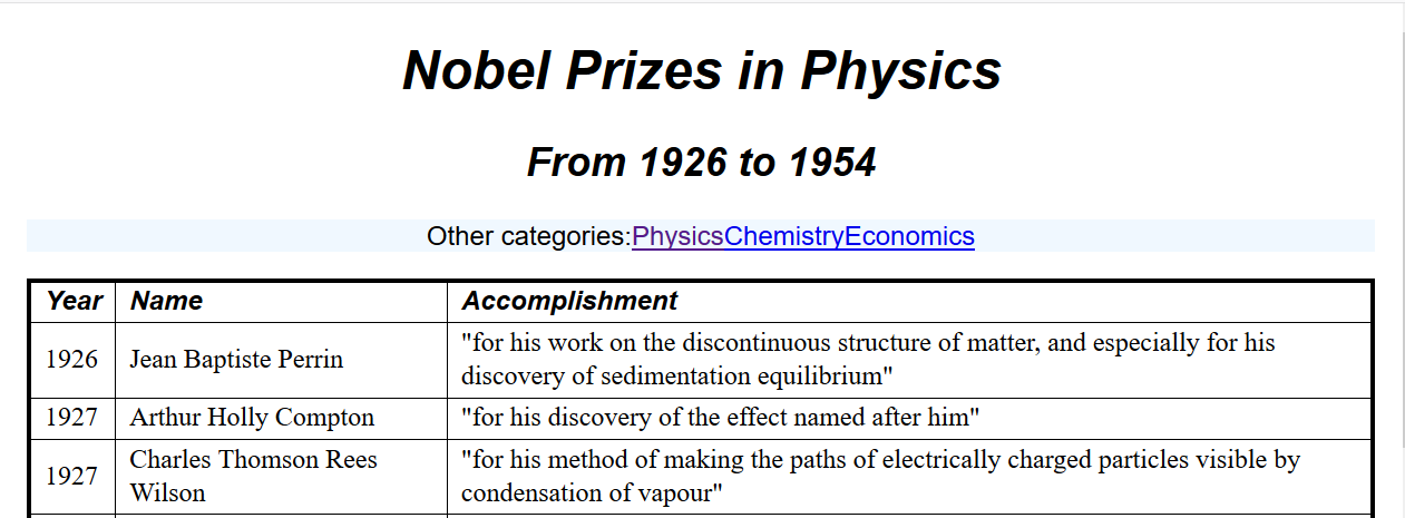
sectionelementFrom me: physics.html, container is the
pelement holding the links to other pages.From me: VerticalTides.html container is the
bodyelement, uses main axis, cross axis, and item properties
What is it?
From MDN:
Flexbox is a one-dimensional layout method for laying out items in rows or columns. Items flex to fill additional space and shrink to fit into smaller spaces.
What is it? II
From CSS Tricks:
The main idea behind the flex layout is to give the container the ability to alter its items’ width/height (and order) to best fill the available space (mostly to accommodate to all kind of display devices and screen sizes). A flex container expands items to fill available free space, or shrinks them to prevent overflow.
Why Flexbox
From MDN: “The following simple layout requirements are either difficult or impossible to achieve with such tools, in any kind of convenient, flexible way:”
- Vertically centering a block of content inside its parent.
- Making all the children of a container take up an equal amount of the available width/height, regardless of how much width/height is available.
- Making all columns in a multiple column layout adopt the same height even if they contain a different amount of content.
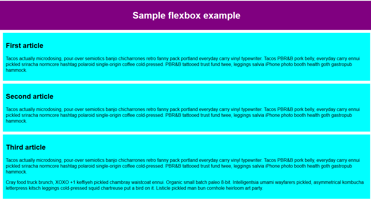
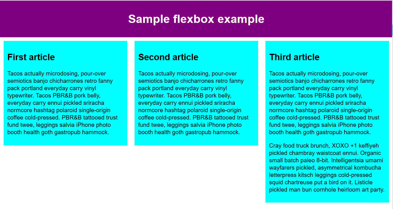
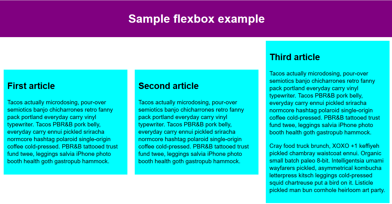
Simple Flexbox Example I
Example from MDN, three articles within a section, default (no flex):
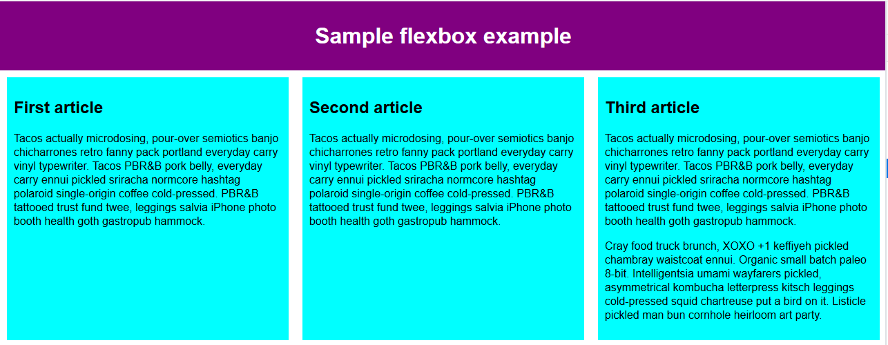
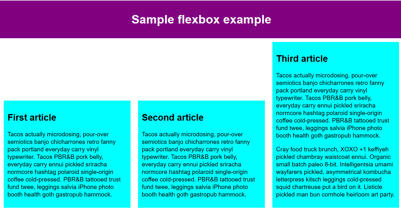
Simple Flexbox Example II
Applying display: flex to the section containing the articles:
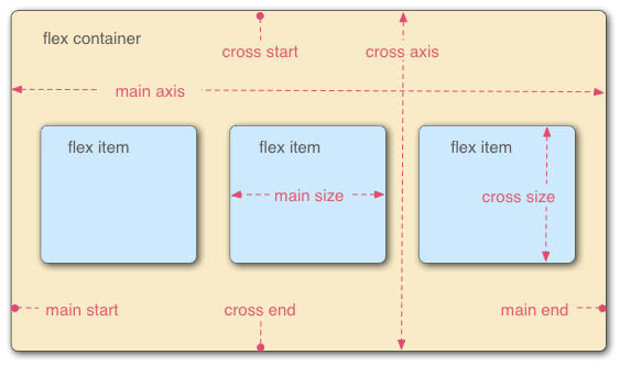
Basic Model/Terminology I
From MDN:
- The main axis is the axis running in the direction the flex items are being laid out in. The start and end of this axis are called the main start and main end.
- The cross axis is the axis running perpendicular to the direction the flex items are being laid out in. The start and end of this axis are called the cross start and cross end.
Basic Model/Terminology II
From MDN:
- The parent element that has display: flex set on it is called the flex container.
- The items being laid out as flexible boxes inside the flex container are called flex items.
Basic Model/Terminology III
From MDN:
Flex Container Properties
display and flex-direction
- Use
display: flex;on the container element to enable flex layout. - Use
flex-direction: property, where property =row,row-reverse,columnorcolumn-reverse - The default
flex-directionisrow
justify-content
From CSS-Tricks:
This defines the alignment along the main axis. It helps distribute extra free space left over when either all the flex items on a line are inflexible, or are flexible but have reached their maximum size.
justify-content values I
From CSS-Tricks:
flex-start(default): items are packed toward the start lineflex-end: items are packed toward to end linecenter: items are centered along the linespace-between: items are evenly distributed in the line; first item is on the start line, last item on the end line
justify-content values II
From CSS-Tricks:
space-around: items are evenly distributed in the line with equal space around them.space-evenly: items are distributed so that the spacing between any two items (and the space to the edges) is equal.
justify-content example I
space-around
justify-content example II
space-between
justify-content example III
center
align-items
From CSS-Tricks:
This defines the default behavior for how flex items are laid out along the cross axis on the current line.
align-items values
From CSS-Tricks:
start: cross-start margin edge of the items is placed on the cross-start lineend: cross-end margin edge of the items is placed on the cross-end linecenter: items are centered in the cross-axisbaseline: items are aligned such as their baselines alignstretch (default): stretch to fill the container (still respect min-width/max-width)
align-items: start
align-items: end
align-items: center
flex-wrap and flex-flow
From CSS-Tricks:
- By default, flex items will all try to fit onto one line. You can change that and allow the items to wrap as needed with the
flex-wrapproperty. flex-wrapvalues:nowrap,wrap,wrap-reverseflex-flowis a shorthandflex-directionandflex-wrapproperties, which together define the flex container’s main and cross axes.- Default is
rownowrap.
align-content
From CSS-Tricks align-content:
This aligns a flex container’s lines within when there is extra space in the cross-axis, similar to how justify-content aligns individual items within the main-axis.
Note: this property has no effect when there is only one line of flex items.
Flex Item Properties
order and flex-grow
From CSS-Tricks:
order: “By default, flex items are laid out in the source order. However, the order property controls the order in which they appear in the flex container.”flex-grow: “This defines the ability for a flex item to grow if necessary. It accepts a unitless value that serves as a proportion. It dictates what amount of the available space inside the flex container the item should take up.”
flex-shrink and flex-basis
From CSS-Tricks:
flex-shrink: This defines the ability for a flex item to shrink if necessary.flex-basis: This defines the default size of an element before the remaining space is distributed. It can be a length (e.g. 20%, 5rem, etc.) or a keyword.
align-self
From CSS-Tricks:
This allows the default alignment (or the one specified by align-items) to be overridden for individual flex items.
Note: The default alignment is the alignment set on the container.
Vertical Layout
Vertical Layout Example
- Centering elements horizontal (some or all)
- Set
<nav>near top and<footer>at bottom with extra space in between - Vertical Spacing tip: For this to work you must set the height property on the flex container
HTML Page
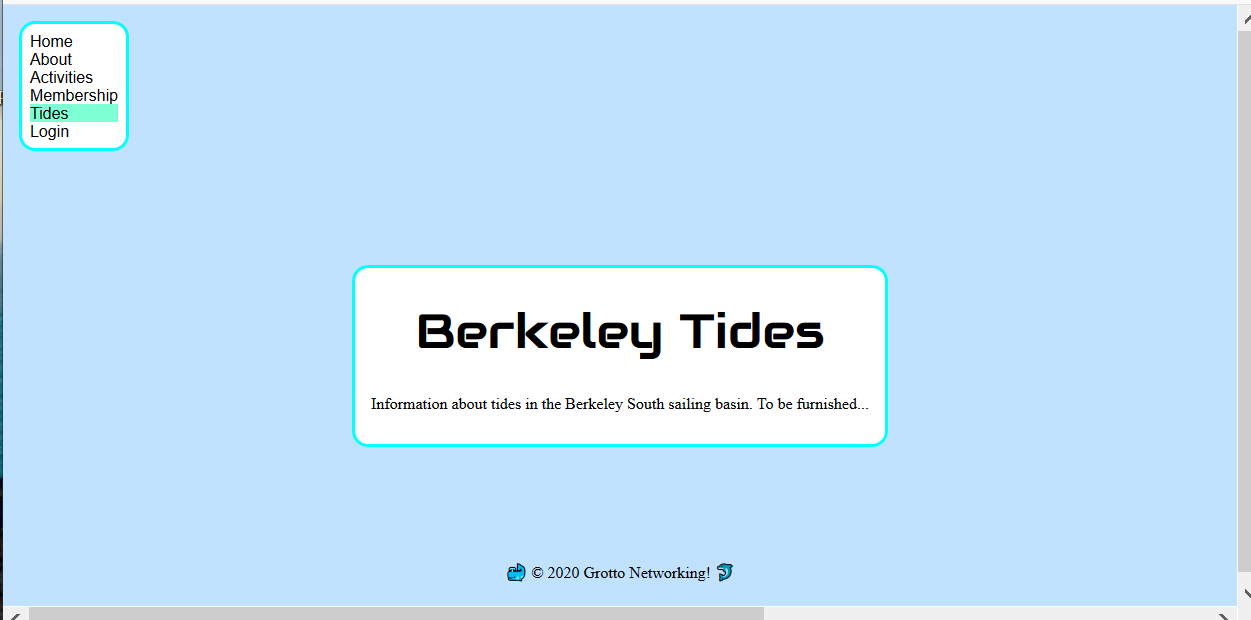
See file VerticalTides.html
<!DOCTYPE html>
<html lang="en">
<head>
<meta charset="utf-8">
<title>Berkeley Tides</title>
</head>
<body>
<nav>
<ul>
<li><a href="index.html">Home</a></li>
<li><a href="about.html">About</a></li>
<li><a href="activities.html">Activities</a></li>
<li><a href="membership.html">Membership</a></li>
<li class="active"><a href="tides.html">Tides</a></li>
<li><a href="login.html">Login</a></li>
</ul>
</nav>
<main>
<header>
<h1>Berkeley Tides</h1>
</header>
<p>Information about tides in the Berkeley South sailing basin. To be furnished...</p>
</main>
<footer>
<p>🐳 © 2020 Grotto Networking! 🐬</p>
</footer>
</body>
</html>No Styling
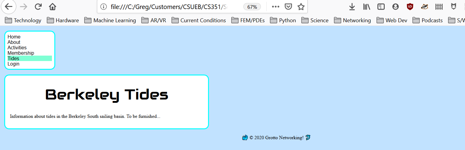
Flex for Centering
body {flex-direction: column; align-items: center;}
Vertical Spacing
body {/* previous stuff */ justify-content: space-between; height: 92vh;}
Adjust nav to Left
nav {align-self: start;}
Final CSS
See file VerticalTides.css
/* Only those parts relevent to the flexbox demo */
body {
    display:flex;
    flex-direction:column;
    align-items:center;
    background-color:#c1e2ff;
    margin: 1em;
    justify-content: space-between; /* Vertical space between */
    height: 92vh; /* Set height for vertical spacing  */
}

nav {
    align-self:start; /* over ride the containers "centering" */
    background-color: white;
    max-width: 10em;
    padding: 0.1em;
    border:aqua solid;
    border-radius: 1em;
}